 Expo Vector Icons 사용하기 (SVG 아이콘)Usage of Expo Vector Icons (SVG Icons)
📅
들어가기 전에 🔗
Expo Vector Icons란? 🔗
Expo Vector Icons는 Expo에서 제공하는 아이콘 라이브러리입니다. 원래 SVG파일을 사용하기 위해서는 별도의 아이콘 파일을 다운받고,
react-native-svg를 설치해야 했지만, Expo Vector Icons를 사용하면 별도의 설정 없이 원하는 아이콘을 사용할 수 있습니다.
이 링크는 Expo Vector Icons에서 제공하는 아이콘을 볼 수 있는 링크입니다. expo.fyi↗Expo Vector Icons 설치하기 🔗
npx create-expo-app 을 사용하여 Expo 프로젝트를 생성하면 Expo Vector Icons가 기본적으로 설치되어 있습니다. 만약 Expo Vector Icons가 설치되어 있지 않다면, 다음 명령어를 사용하여 설치할 수 있습니다.
npm i @expo/vector-iconsExpo Vector Icons 사용하기 🔗
먼저, expo.fyi↗에서 사용하고 싶은 아이콘을 검색합니다. 검색한 아이콘을 클릭하면 두 가지 코드가 나오게 됩니다.

첫 번째 코드는
import { 아이콘 패키지 } from '@expo/vector-icons';이고, 두 번째 코드는 <아이콘 컴포넌트 />입니다. 두 코드를 복사하여 프로젝트에 붙여넣으면 아이콘이 나타납니다. 아래는 예시 코드와 결과입니다.import AntDesign from '@expo/vector-icons/AntDesign';
import { SafeAreaView } from 'react-native-safe-area-context';
const App = () => {
return (
<SafeAreaView
style={{ flex: 1, justifyContent: 'center', alignItems: 'center' }}
>
<AntDesign name="checkcircle" size={24} color="black" />
</SafeAreaView>
);
};
export default App;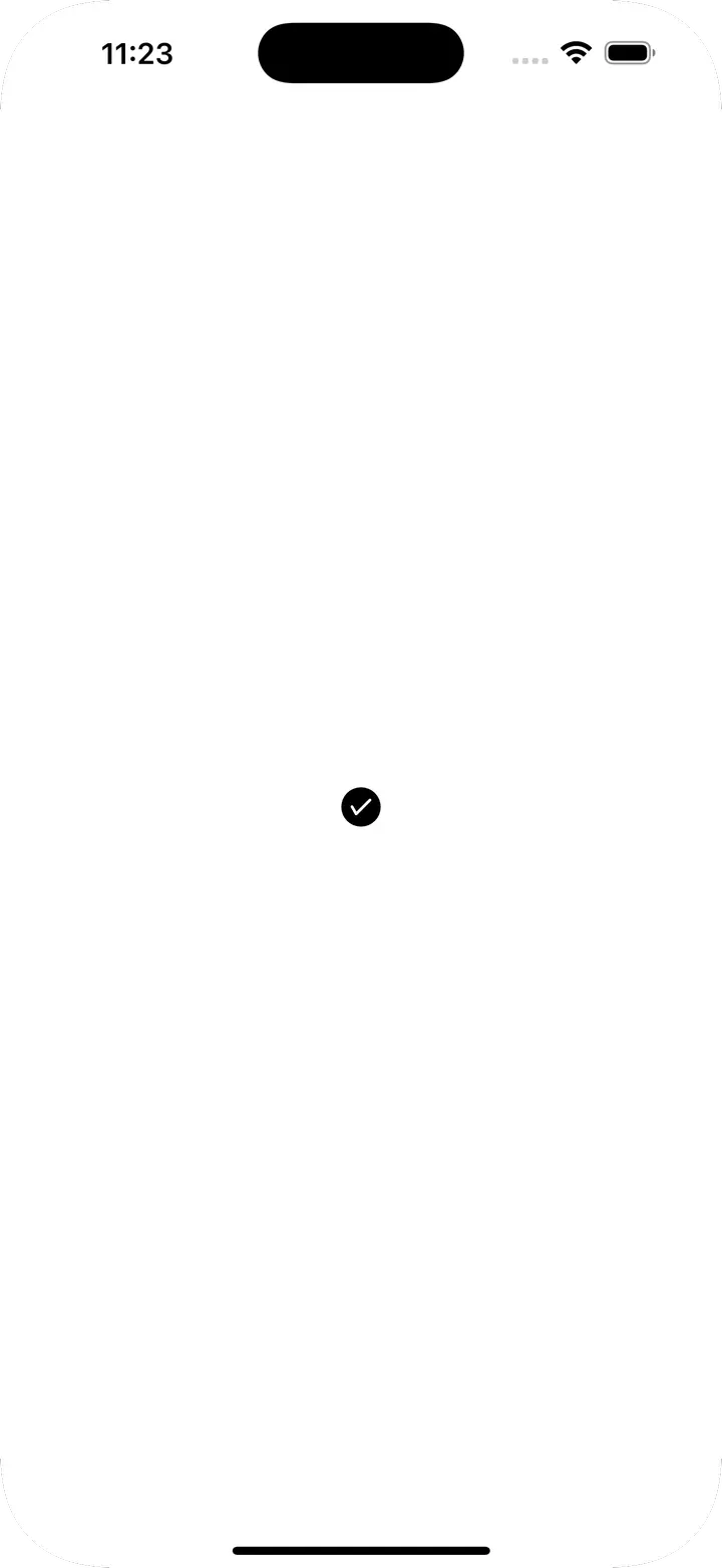
버튼 컴포넌트 🔗
@expo/vector-icons에는 특별한 컴포넌트가 있습니다.
Icon.Button 컴포넌트는 아이콘과 텍스트를 함께 사용할 수 있습니다. 아래는 예시 코드와 결과입니다.import AntDesign from '@expo/vector-icons/AntDesign';
import { SafeAreaView } from 'react-native-safe-area-context';
const App = () => {
return (
<SafeAreaView
style={{ flex: 1, justifyContent: 'center', alignItems: 'center' }}
>
<AntDesign.Button
name="checkcircle"
size={24}
color="white"
backgroundColor={'green'}
onPress={() => console.log('Button Pressed')}
>
Press Me
</AntDesign.Button>
</SafeAreaView>
);
};
export default App;
세부 props 🔗
| Prop | 설명 | 타입 | 기본값 |
|---|---|---|---|
| name | 아이콘 이름 | string | X |
| size | 아이콘 크기 | number | 20 |
| color | 아이콘 색상 | string | white |
| backgroundColor | 버튼 배경색 | string | #007AFF |
| onPress | 버튼 클릭 시 실행할 함수 | () => void | null |
| borderRadius | 버튼 테두리 둥글기 | number | 5 |
| iconStyle | 아이콘 스타일 | StyleProp | {marginRight: 10} |
결론 🔗
이렇듯 expo에서는 기본적으로 많이 사용되는 아이콘 모음을 제공하고 있습니다. 따라서 별도의 설정 없이 바로 사용할 수 있어 편리합니다. 특히 Button 컴포넌트는 수많은 css와 style을 적용할 필요 없이 간단하게 사용할 수 있어서 자주 사용할 것 같습니다.
더 생각해 보기 🔗
- 다른 아이콘 라이브러리가 있을까요? 어떤 라이브러리가 있을까요?
- custom icon fonts↗라는 기능도 있습니다. 아이콘에 커스텀 폰트를 적용할 수 있도록 도와주는 기능인데, 어떤 경우에 사용할 수 있을까요?