 Displaying Toast Messages in React Native with react-native-toast-message
📅
This post uses Expo and react-native-toast-message↗ version 2.2.1. The same approach also works in React Native CLI projects.
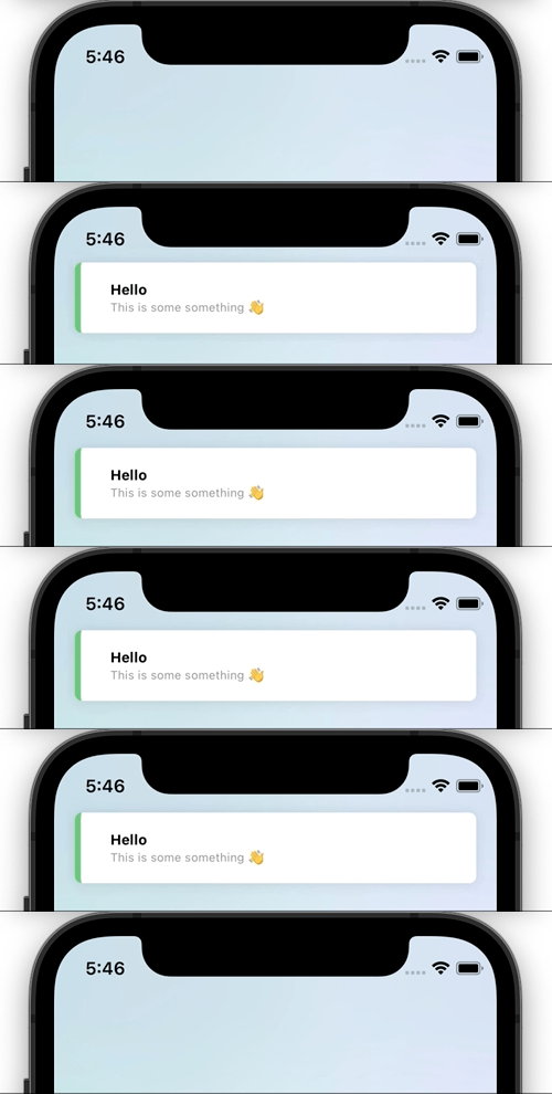
npm install react-native-toast-message/app/_layout.tsx, the file defining the project's top-level page, as follows.import Toast from 'react-native-toast-message';
export default function RootLayout({ children }: { children: React.ReactNode }) {
return (
<View>
{children}
<Toast />
</View>
);
}app.tsx, the file defining the project's top-level page, as follows.import Toast from 'react-native-toast-message';
export function App( props: any ) {
return (
<>
{/* ... */}
<Toast />
</>
);
}import Toast from 'react-native-toast-message';
import { Button } from 'react-native'
export function Page() {
const showToast = () => {
Toast.show({
type: 'success',
text1: 'Hello',
text2: 'This is some something 👋'
});
}
return (
<Button
title='Show toast'
onPress={showToast}
/>
)
}/app/_layout.tsx in Expo or app.tsx in React Native CLI, where the toast component is declared.
This example displays three kinds of toast messages.
The success and error types modify the default toasts, while tomatoToast uses a custom toast.import Toast, { BaseToast, ErrorToast } from 'react-native-toast-message';
const toastConfig = { // config 변수 추가
success: (props) => (
<BaseToast
{...props}
style={{ borderLeftColor: 'pink' }}
contentContainerStyle={{ paddingHorizontal: 15 }}
text1Style={{
fontSize: 15,
fontWeight: '400'
}}
/>
),
error: (props) => (
<ErrorToast
{...props}
text1Style={{
fontSize: 17
}}
text2Style={{
fontSize: 15
}}
/>
),
tomatoToast: ({ text1, props }) => (
<View style={{ height: 60, width: '100%', backgroundColor: 'tomato' }}>
<Text>{text1}</Text>
<Text>{props.uuid}</Text>
</View>
)
}
export default function Page() {
return (
<View>
{children}
<Toast config={toastConfig} />
</View>
);
}import Toast from 'react-native-toast-message';
import { Button } from 'react-native'
export function Page() {
const showToast = () => {
Toast.show({
type: 'tomatoToast',
props: { uuid: 'uuid example' }
});
}
const showErrorToast = () => {
Toast.show({
type: 'error',
text1: 'Error',
text2: 'This is some something 👋'
});
}
return (
<Button
title='Show toast'
onPress={showToast}
/>
)
}