In part 3, we wrote tests for the
Counter
component and saw a satisfying
FAIL
message.
That failure is a compass showing us what to do next.
Today, we will move to the
Green
step, turning that red light green.
It is fine if the code is a little rough. For now, let's focus on passing the tests.
Step 1: Create a Minimal Rendering Structure 🔗 The first error when running our tests was that the component file could not be found.
Let's create the file so it exists.
Create src/components/Counter.tsx.
src/components/Counter.tsx export default function Counter () { return ( < div > { /* 아직은 아무 내용도 없는 빈 껍데기입니다 */ } </ div > ); } Back in the test file (Counter.test.tsx), the import that was underlined in red can now be resolved.
Step 2: Add the UI Elements (Static Implementation) 🔗 Run the tests again.
This time, you will probably see this error:
TestingLibraryElementError: Unable to find an element with the text: /현재 숫자: 0/
The test is looking for the text “현재 숫자: 0” (“Current number: 0”) and a “+” button, but our component is empty.
Set the behavior aside for now and start by hardcoding the visible elements.
src/components/Counter.tsx export default function Counter () { return ( < div > < p >현재 숫자: 0</ p > < button type = "button" >+</ button > </ div > ); } This alone passes half of the tests.
RTL
is satisfied that the text “현재 숫자: 0” and the “+” button are on the screen.
Step 3: Connect State (useState) 🔗 One final hurdle remains.
The test expects the number to change to
1
when the button is clicked.
Currently, however, it is fixed at
0
.
To solve this, we need
React
's state management hook,
useState
.
The screen must change in response to a user action: clicking.
src/components/Counter.tsx import { useState } from 'react' ;
export default function Counter () { // [상태] 숫자를 기억하는 메모리 상자(state)를 만듭니다. 초기값은 0입니다. const [ count , setCount ] = useState ( 0 );
const handleClick = () => { // [동작] 기존 값에 1을 더해줍니다. setCount ( prev => prev + 1 ); };
return ( < div > { /* 고정된 숫자 0 대신, 변하는 값 count를 보여줍니다. */ } < p >현재 숫자: { count } </ p > { /* 버튼을 누르면 handleClick 함수가 실행됩니다. */ } < button type = "button" onClick ={ handleClick } > + </ button > </ div > ); }
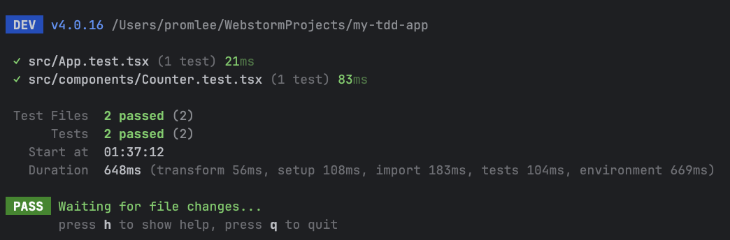
Step 4: Confirm the Tests Pass (Green) 🔗 Implementation is complete.
Let's check whether the tests really pass.
Open a terminal and run:
Terminal Test results
 PASS  src/components/Counter.test.tsx
  Counter 컴포넌트 동작 테스트
    ✓ 초기값은 0이며, + 버튼을 누르면 숫자가 1 증가한다 (50 ms)
If you see a green
PASS
, we have succeeded!
We have completed the
Red (failure) -> Green (success)
stages of the TDD cycle.
Review Why the Tests Pass 🔗 Let's revisit why our code passes the tests.
Initial state
useState(0) renders “현재 숫자: 0”, and getByText finds it.Button existence
The <button>+<button> tag allows getByRole('button', { name: '+' }) to succeed.Click behavior
When user.click() runs, the onClick event triggers setCount.Result verification
The state changes to 1, the screen rerenders, and the text “현재 숫자: 1” (“Current number: 1”) is found.
Terminal git clone https://github.com/PROMLEE/my-tdd-app.git cd my-tdd-app git checkout part4 Today, we implemented a real component to make failing tests pass.
Minimal implementation
Instead of trying to write perfect code immediately, we first added the elements the tests required: text and a button.State management
We added useState
only where a value needed to change, completing the dynamic behavior.Confidence
Passing tests mean that the component fully meets its minimum requirements.
The code is so simple that there may not appear to be much to improve.
What happens when the component becomes more complex?
Next time, in
Part 5: Refactoring Components While Maintaining Tests
, we will explore cleaning up code with tests in place.
 Implementing a Basic Component to Pass Tests — TDD with React, Part 4