 Expo Vector Iconsを使う(SVGアイコン)
📅
react-native-svg をインストールする必要がありました。Expo Vector Iconsを使うと、追加設定なしで必要なアイコンを利用できます。
利用できるアイコンは、expo.fyi↗で確認できます。npm i @expo/vector-icons
import { 아이콘 패키지 } from '@expo/vector-icons';、2つ目は表示用の <아이콘 컴포넌트 /> です。両方をコピーしてプロジェクトに貼り付けると、アイコンが表示されます。次はコードと実行結果の例です。import AntDesign from '@expo/vector-icons/AntDesign';
import { SafeAreaView } from 'react-native-safe-area-context';
const App = () => {
return (
<SafeAreaView
style={{ flex: 1, justifyContent: 'center', alignItems: 'center' }}
>
<AntDesign name="checkcircle" size={24} color="black" />
</SafeAreaView>
);
};
export default App;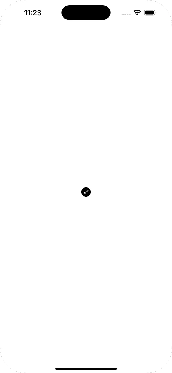
Icon.Button コンポーネントがあります。次はコードと実行結果の例です。import AntDesign from '@expo/vector-icons/AntDesign';
import { SafeAreaView } from 'react-native-safe-area-context';
const App = () => {
return (
<SafeAreaView
style={{ flex: 1, justifyContent: 'center', alignItems: 'center' }}
>
<AntDesign.Button
name="checkcircle"
size={24}
color="white"
backgroundColor={'green'}
onPress={() => console.log('Button Pressed')}
>
Press Me
</AntDesign.Button>
</SafeAreaView>
);
};
export default App;
| Prop | 説明 | 型 | デフォルト値 |
|---|---|---|---|
| name | アイコン名 | string | X |
| size | アイコンの大きさ | number | 20 |
| color | アイコンの色 | string | white |
| backgroundColor | ボタンの背景色 | string | #007AFF |
| onPress | ボタンを押したときに実行する関数 | () => void | null |
| borderRadius | ボタンの角の丸み | number | 5 |
| iconStyle | アイコンのスタイル | StyleProp | {marginRight: 10} |