 使用Expo Vector Icons
📅
react-native-svg,而使用Expo Vector Icons,不必额外配置就能调用所需图标。
可以通过expo.fyi↗查看提供的图标。npm i @expo/vector-icons
import { 아이콘 패키지 } from '@expo/vector-icons';,第二段是<아이콘 컴포넌트 />。把两段代码复制到项目中,就能显示图标。下面给出示例与结果。import AntDesign from '@expo/vector-icons/AntDesign';
import { SafeAreaView } from 'react-native-safe-area-context';
const App = () => {
return (
<SafeAreaView
style={{ flex: 1, justifyContent: 'center', alignItems: 'center' }}
>
<AntDesign name="checkcircle" size={24} color="black" />
</SafeAreaView>
);
};
export default App;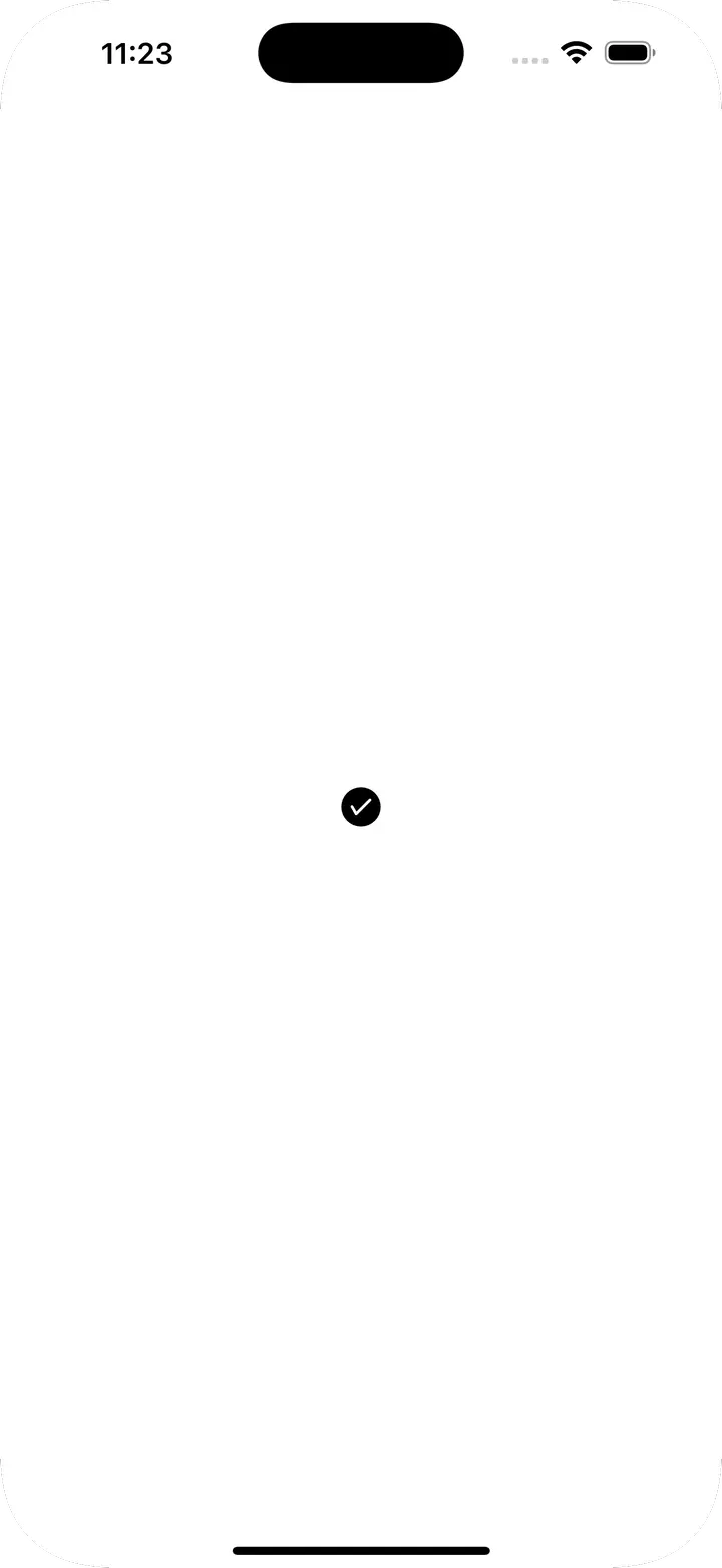
Icon.Button可以同时显示图标与文字。下面是示例和结果。import AntDesign from '@expo/vector-icons/AntDesign';
import { SafeAreaView } from 'react-native-safe-area-context';
const App = () => {
return (
<SafeAreaView
style={{ flex: 1, justifyContent: 'center', alignItems: 'center' }}
>
<AntDesign.Button
name="checkcircle"
size={24}
color="white"
backgroundColor={'green'}
onPress={() => console.log('Button Pressed')}
>
Press Me
</AntDesign.Button>
</SafeAreaView>
);
};
export default App;
| Prop | 说明 | 类型 | 默认值 |
|---|---|---|---|
| name | 图标名称 | string | X |
| size | 图标大小 | number | 20 |
| color | 图标颜色 | string | white |
| backgroundColor | 按钮背景色 | string | #007AFF |
| onPress | 点击按钮时执行的函数 | () => void | null |
| borderRadius | 按钮圆角 | number | 5 |
| iconStyle | 图标样式 | StyleProp | {marginRight: 10} |